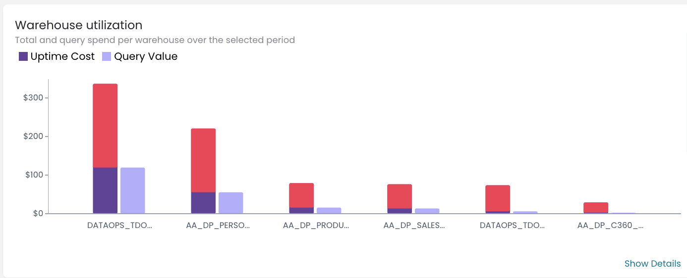
Another skillful use of the Warehouse utilization graph is that you can easily identify redundant warehouses. If you have already applied the optimizations that we recommended in
“How to gain control over your Snowflake spending in minutes?”
And you are still seeing a graph like this one:

This means you have a lot of warehouses that you are not using 100%.
The recommended action here is to reduce them by combining 2-3 of them into one.
By doing so, you switch the warehouse used by different applications or users to the same one. This approach will significantly enhance your cost efficiency.
Naturally, the question that arises here is how can we be sure that we are not over optimizing, and that we won’t negatively impact performance?
We have considered this scenario as well. In our post - “Find bottlenecks in current warehouses setup” , we are focusing on the graphs that can help you identify warehouses experiencing performance issues.

